Lazy UX Design - Phone Number Fields
- 15 May, 2016
Grrr, I hate poorly designed forms. I’m especially annoyed by forms that want humans to think like computers. Case in point, take a look at this phone number field from Bed Bath and Beyond. 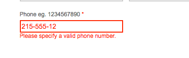
Phone numbers in the US can take many forms - parens around the area and dash separated are the most common. What isn’t common is a form typed out without any separators. However, lazy design forces that on people.
One side effect of this design is that the auto form completion built into browsers and password managers break when used here.
When you are thinking about your input fields, think about how your customers think about the information they are providing and provide support for the most common patterns.
Stay Ahead in Product Management!
Ready to elevate your product management game? Join our community of passionate professionals and be the first to receive exclusive insights, tips, and strategies directly in your inbox. Subscribe now to our newsletter and ensure you're always in the loop with the latest product management trends and wisdom bombs!